As architects and sustainability consultants, we think about space planning and design every day. But recently, the design process has hit a little closer to home. We are looking to find a new office space in the next two years for our Philadelphia office. As you might imagine, there are a lot of design opinions and wish lists being thrown around. Are our desks going to be smaller? Can we have more plants? Will I still get to sit next to my friends? And most importantly, what is this place going to look like? We recently completed an office-wide survey, welcoming any and all comments starting with where the space should be located, to what amenities should be nearby, all the way to the hotly anticipated “is there anything else on your mind that you would like to share?” question. Results were detailed, helpful, and exciting as we jump in together as a firm for this new chapter of our company.
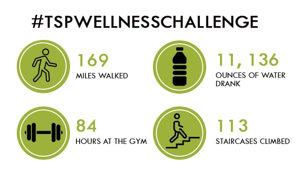
But for the last month as we shifted our focus on more movement, breaks from constant computer screen time, and getting out of the office during lunch, a few more office design requirements appeared. During the month of April, over half of The Sheward Partnership employees participated in an office wellness challenge. The challenge lasted 4 weeks and took place during the work week. Each day, participants had to complete 4 out of 6 optional wellness tasks. Tasks included drinking 64 ounces of water, exercising for 30 minutes, getting 7 hours of sleep the night before, going up the stairs in our office 5 times, walking 10 laps around our office, and going for a walk during lunch to 18th and back from our 23rd street office. Participants had to complete their choice of 4 tasks each day of the work week to fully “accomplish” one week. At the end of four weeks, participants were entered into a prize drawing, one entry for each week they completed. Look at what we accomplished!

DO YOU THINK ABOUT BUILDINGS? WE DO!
In a recent report released by the U.S. Green Building Council and the Living Standard, researchers found that people rarely think about buildings. To most, buildings are aesthetically pleasing, sometimes artistic, and serve a purpose for living and working, but most people do not think about their long-term impact on our well-being or that of the environments. But according to the EPA, Americans spend 90% of their time indoors. So what design features did our employees want in our new office based on this wellness challenge? Here is some of the feedback we received and what we will look to implement in more design projects outside of our own office, as well:
INCORPORATING WELLNESS INTO OUR DESIGN WORK
1. Accessible, Centralized, and Appealing Staircase
If you asked the majority of our office to take the stairs to the 4th floor, they wouldn’t be able to find the staircase in the first place. The stairs in our building are very hidden and industrial emergency spaces with no daylight or views. Our office space is currently on the first floor with a staircase in our suite that leads to a mezzanine of offices. But in a new space where our suite is on a higher floor, focus on stairs would be greatly desired. When an attractive, fun, and central staircase is celebrated in the lobby of a building, taking the stairs becomes the desired mode of transportation. According to the WELL Building Standard, staircases should be clearly visible from the main entry lobby and visually located before any elevators, in order to promote their use. Signage near the elevators should also promote the use of the staircase as an alternative.
Action Step: Design an office lobby or school classroom wing around the circulation; include a feature staircase to encourage movement and enjoyable stair climbing
2. Movable Work Station Furnishings
Ergonomics is about designing for people. As our culture has shifted to more screen time and even less movement, the chairs and desks that we sit at are more important. A balance between sitting and standing can be achieved with sit-stand desks, monitor arms, and keyboard trays that can all be adjusted to your own body needs. These products encourage more movement and comfort throughout the day, as well as safe and sustainable posture. The WELL Building Standard also inspires building owners to provide treadmill desks, bicycle desks, or portable desk pedal machines where applicable.
Action Step: Provide each workstation with a movable desk or monitor arms
3. Huddle Rooms
A design feature that our current space lacks is huddle rooms for smaller team meetings. Typically, smaller meetings happen at our workstations, which takes away the opportunity to walk to a meeting. Employees have requested more huddle rooms and telephone spaces for other practical reasons as well. Short bursts of movement break up the monotony of a very sedentary day.
Action Step: Incorporate huddle rooms away from main work station area to reduce distraction and encourage walking
4. Walking Loop Built Into Office Layout
We didn’t realize it before, but almost all participants were big fans of the walking loop we established in the office. The loop only takes about 30-45 seconds to walk, but encourages movement and taking breaks throughout the day. In fact, this is a part of the Fitness Feature in the WELL Building Standard. Interior Fitness Circulation suggests incorporating accessible, safe, and visually appealing stairs, entryways, and corridors to encourage intermittent bouts of physical activity and reduce sedentary behavior. These corridors should incorporate artwork, music, daylighting, windows, or biophilic design elements where possible.
Action Step: Integrate a circular walking path through or around the office space, preferably away from work stations to prevent distraction
5. Daylighting
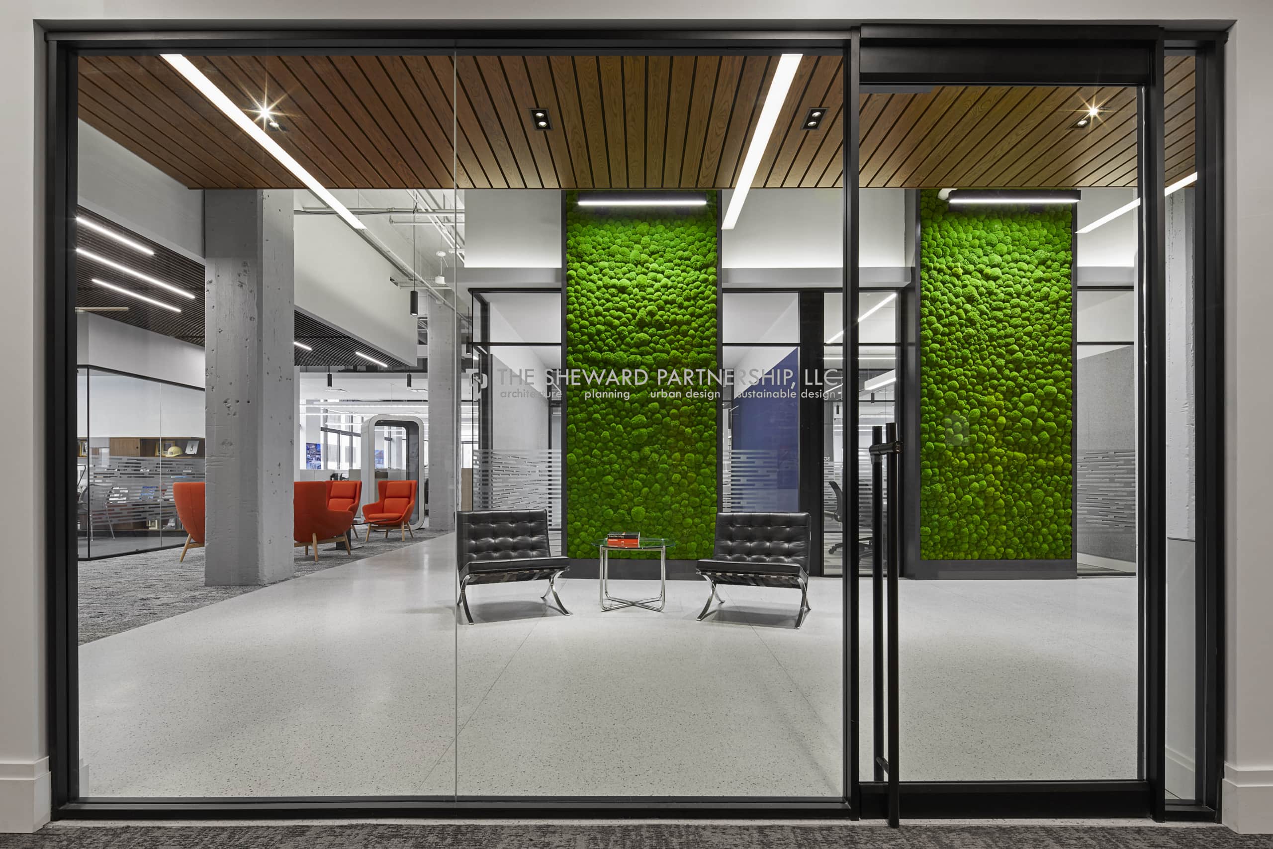
An unusual feature of our current space is that we have daylight on three sides of our space. You can see trees and sky from most seats in our office. According to the WELL Building Standard, exposure to appropriate amounts of natural light reinforces the alignment of our circadian rhythms and it also can improve occupant mood, alertness and overall health. These views of nature and daylight also encourage employees to get outside during lunch when they see the sun shining and lots of people out and about.
Action Step: Prioritize helpful levels of daylight and scenery in our designs to improve employee morale and productivity
6. Signage & Wellness Facts
One of the most important parts of a LEED or WELL project is educating the occupants of the building on their new green space and how they can make the best use of all of its sustainable features. Educating people on the choices they make each day is important. Wayfinding signage can be placed near elevators to encourage stair use. Signs can be placed on the wall next to a bottle filling station to educate the user on the benefits of staying hydrating at work or school. The WELL Building Standard encourages educational signage in eating areas or common areas to promote the consumption of whole, natural foods and discourage sugary or processed foods and beverages.
Action Step: Place intentional signage in the kitchen, near elevators, and staircases. Educate building occupants on the wellness features of their building.
At the end of the TSP Wellness Challenge, 90% of participants felt that the presence of a challenge or a wellness program in the office encouraged them to make healthier lifestyle choices. 100% of participants felt a boost in office morale, a sense of camaraderie, teamwork, and accountability as a group. The most obvious takeaway from our challenge is that wellness really matters to employees. Whether in physical office design and layout, internal office programs, or accessibility to parks, fitness classes, and community events; this could make or break the recruitment and retention of top talent.
Written by Jo Evans
Marketing Manager
RESOURCES
United States Environmental Protection Agency: Indoor Air Quality Report
WELL Building Standard
Living Standard: The Standard Issue 001


